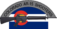
the current logo doesn't look that hot (to me) in subdued. For this, I say color.
now I'm sure we can come up with something else in subdued or maybe modify the current one to make it look better in two tone. Definately need to do away with the 'box' around the logo.

Colorado AR-15 Shooters Club Discussion Forums
Welcome to the Colorado AR-15 Shooters Club Discussion Forums.

 Reply With Quote